Neon Signs in Massachusetts, 1925-70

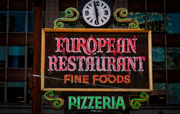
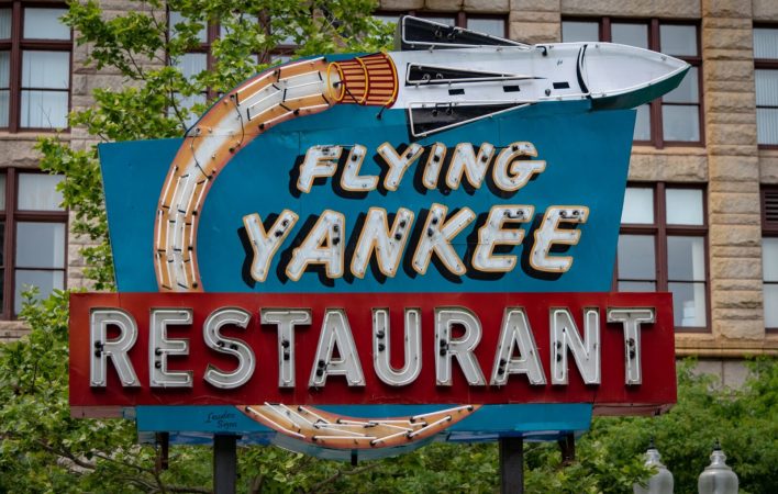

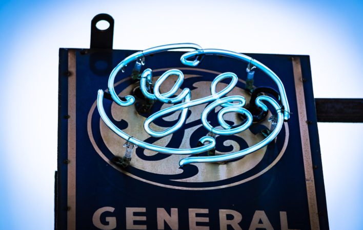
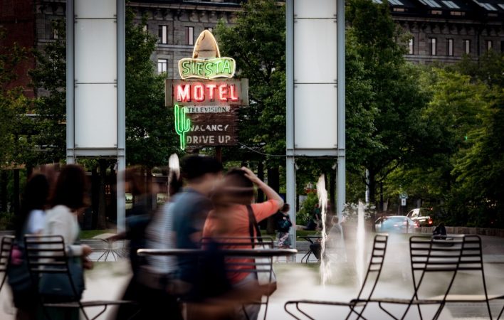
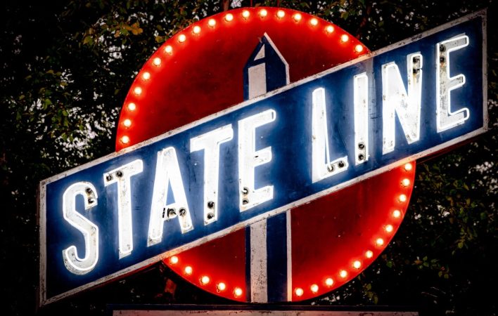
Exhibit Overview
The signs in this exhibition are drawn from the collection of Dave and Lynn Waller, who have devoted significant time and energy to preserving and documenting Massachusetts’ neon past. The Greenway Conservancy would like to thank Dave and Lynn Waller for their generosity in lending these signs to GLOW.
The signs will be illuminated from 8am-11pm daily until April of 2019.
Neon was a special moment in a long history of human illumination. Central Boston has been lit by various forms of artificial light since pairs of night watchmen began patrolling city streets in 1635, swinging lanterns from hand-held poles. Oil-lit street lamps were installed in Boston in 1773, spreading light through the most-populated sections of the town. Well-lit public spaces are a prerequisite for safety, prosperity and social life. The spread of municipal lighting in Massachusetts fundamentally changed the relationship between night and day, allowing people to work longer hours and navigate greater distances in the dark. Beer gardens and restaurants, lit with bright new gas fixtures, heralded the arrival of a genuine nightlife in the nineteenth century. Restaurants blossomed across town, and ordinary people expanded the number of hours they spent outside the walls of their homes. The turn of the twentieth century marked the spread of electric light through the metropolitan area, creating the comfortable environment familiar to us today. Most of us take the different types of light available for granted, pausing perhaps for candles, but otherwise not noticing the different types of light in operation. Incandescent bulbs, fluorescent tubes, halogen lamps, xenon headlights, and the light-emitting diodes each have their own characteristics and best uses.
Neon light, which was introduced to the United States from Paris in the 1920s, has a particular magic. The term “neon” is a bit of a misnomer, as the name refers only to one of the noble gases used in neon lights. (The other gases include argon, helium and krypton). Neon’s distinctive, colorful glow, the ease with which its displays can be customized, as well as its relatively affordable running costs, gave it a special appeal to advertisers. The first clients for neon signs in the United States included theaters, which had already pioneered mass electric publicity with flashing incandescent bulbs, and large corporations. It was corporate clients who distributed small signs like the GE Radio sign, as well as large-scale animated mural “spectaculars,” like Boston’s much-beloved CITGO sign. Neon lighting was a popular investment for merchants during the Great Depression, who used the bright, inexpensive tubing to update their storefronts and attract hard-to-come-by customers.
After World War II, neon experienced a kind of golden age. As large corporations embraced the low shipping costs and ease of distribution offered by standardized backlit-acrylic signs, neon signage became a niche opportunity for small business owners. Both the clients and the fabricators of these postwar signs tended to be small-scale entrepreneurs, often seeking to advertise diners, motels and other roadside businesses. The design of a neon sign in the 1950s might typically have been drawn by a business owner, copied from a trade booklet, or created by a local sign-maker. For small business owners, neon’s relative affordability, as well as its ease of fabrication, meant that they could advertise their offerings on a scale suited to the increasingly automotive landscape of the postwar era.
All of the signs you see in GLOW became landmarks in their neighborhoods and towns. Most were illuminated for decades, some for the full length of time that the company was in business. In a postwar landscape increasingly dominated by the automobile, highways and homogenous corporate architecture, handmade neon signs like the most of the signs on display here became distinctive landmarks. These glittering, creative neon signs were in some ways more memorable than ways than the ordinary buildings next to which they flashed, flapped and blinked. Neon signage may not have been an art form, but it was – and still is – a form of creative expression. In Massachusetts and elsewhere, neon sign-making requires an unusual fusion of craftsmanship, scientific expertise, and graphic design talent. Each of the signs in GLOW is evidence this unique blend of skills on the part of its fabricator. Viewed together, the signs are part of Massachusetts’ graphic and creative history as well as a legacy of the Bay State’s history of entrepreneurship.
In placing these signs together on a park in central Boston, the Greenway Conservancy is inviting you to consider new ways of interpreting these signs; and contemporary ways of thinking about how neon light can work as a catalyst for engaging with and in public space. Some visitors may remember one or more of these signs as favorite food destination, place of employment, or simply a bright, flashing landmark on a well-travelled route. If you are new to Massachusetts, or just visiting Boston, these signs are evidence of the small businesses which flourished here. By bringing together signs from different locations in Massachusetts, this exhibition offers a brief tour of a much larger state. By placing these signs in close proximity with each other, the Greenway is creating a new geography of light, inviting you to consider how the presence or absence of light can define a space, how particular kinds of light can encourage us to come together, how light can create open, inclusive spaces for dialogue about technology, creativity, and the shared heritage of our built environment.
– Victoria Solan, Architectural Historian and Consultant Historian, GLOW Exhibition.
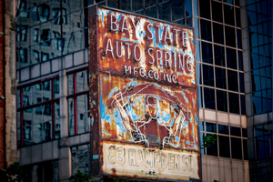
Bay State Auto Spring
83 Hampden Street, Roxbury, c. 1965
Industrial workshops have always been part of the landscape of central Boston. When Jack Kepnes opened Bay State Auto Spring in 1920, the site he chose had once been a blacksmith’s shop. The site on Hampden Street, just to the south of Boston Medical Center, was largely surrounded by residential buildings. Like other business owners, Kepnes increased the visibility of his shop with a series of eye-catching signs. This sign, fabricated in the mid-1960s, replaced a similar neon design built in the 1940s, although the company logo of the muscular worker may date back to the 1930s.
Bay State was one of few shops in central Boston to offer custom-forged brake springs, and the Kepnes’ reputation for excellent work kept the company is business even after the Southeast Expressway siphoned traffic off Hampden Street. At its peak, Bay State had some 20 employees, 24 service bays, as well as two furnaces and blacksmith’s equipment for the forging of replacement springs.
The distinctively-drawn mechanic on the Bay State sign, demonstrates the versatility of neon as a sign-maker’s medium. With practice, neon sign-makers could duplicate not just different letterforms, but also the human body. The blue-capped laborer is flexing his muscles while working on a large leaf spring. Leaf springs, which were first used on horse-drawn carts, absorb the shocks and vibration caused when a vehicle travels over a bumpy surface. They were used in almost all cars and trucks beginning at about the time Kepnes opened his shop, and demand for repair and replacement quickly boomed. A standard component of car and truck suspensions for decades, leaf springs were replaced by higher-performing coil springs in most passenger cars by the 1970s.
Bay State continued to thrive on a steady demand for truck and van brakes, in addition to other repair services. Eventually, the rising costs of labor and energy, as well as changes in the global marketplace for automotive parts challenged the sustainability of the business. By the time Bay State closed in the early 2000s, it had provided a living for generations of the Kepnes family and a multitude of their employees. The flexing spring man, with his muscular neon forearms, is a fitting monument to the work of Bay State’s laborers.
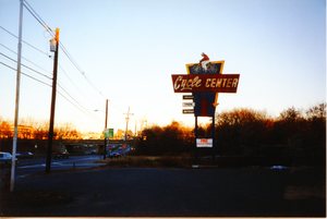
Cycle Center
Route 9, Natick MA, 1956
When Viennese émigré Alan Berg open the Cycle Center in 1956, he knew he would need a bold sign to attract the attention of local commuters. This distinctive image of a recreational cyclist was hoisted high on two steel posts and placed close to the edge of busy Route 9. Below the cyclist, the name of the store was illuminated in enormous neon letters across rectangular panel, the world “Cycle” in italics and “Center” in block capital letters. Pulsating incandescent bulbs wrapped around the cyclist, ending in a downwards arrow which indicated the pull-off point for the store’s parking lot. Despite its size — the original sign was more than twenty feet wide – the Cycle Center’s sign became a much-loved Natick landmark. The neon cyclist, with its flashing wheel spokes, created a cheerful image of muscle-propelled movement in an increasingly automotive landscape.
According to Diana Levinson, the sign became the emblem for a family business which “wasn’t like any other place.” Levinson, who ran the family business after her father Alan Berg retired, remembered “we were part of the anti-slick movement,” a store which deliberately catered to families seeking affordable bicycles, rather the promoting high-end equipment. When Levinson closed the Cycle Center in 1997, she fondly told a reporter “I have a personal relationship with this sign.” Levinson was likely not alone in her affection for the neon cyclist: her family’s store served Natick-area customers for more than 40 years.
Like most of the signs in this exhibition, the Cycle Center’s neon sign was fabricated by a small firm, in this case a Boston company called “Jim Did It Signs.” The backlit signs for various bicycle companies were likely added later. There is no longer any record of the signs’ designer, who may or may not have been inspired by other bicycle signs of the period featuring animated wheel movement. Whether or not the design of the sign was local, there is no question that it immediately became a defining part of the landscape around it.
Natick, which incorporated in 1781, experienced its first major wave of growth when it became an industrial town known for shoe-making in the early nineteenth century. By the mid-1950s, the spread of the suburbs turned Natick into a middle-class suburb of Boston. The cheerful cyclist, who illuminated Natick’s evenings with an image of popular, affordable recreation, was a monument to the town’s broader transformation.


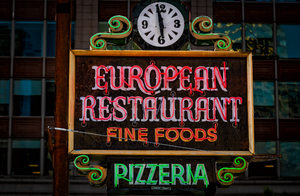
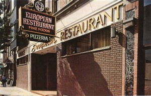
European Restaurant
218 Hanover Street, Boston, 1970
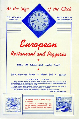
“At the Sign of the Clock,” a 1933 menu from the European Restaurant reminded its patrons, “it’s always time to have a bite to eat.” On a narrow site in the North End, the European competed with dozens of nearby establishments to attract hungry customers. Commissioned as a replacement for earlier clock-based signs, this double-sided sign was fabricated by the Mobeco/Janedy Company. Projecting out above the Hanover Street sidewalk, the sign sought to catch the eye of hungry customers from 1970 until the restaurant closed in 1997.
Originally envisioned as part of a larger hotel and bar complex when it was founded in 1917, the European stood firm as the neighborhood around it changed from a densely-populated immigrant community to a tourist destination. In its final years, the restaurant’s role in evoking the storied history of the North End was part of its commercial appeal. Long-term employees provided a sense of continuity and the kitchen’s pizza and pasta dishes changed little over the years. Returning customers, often suburbanites or out-of-towners, were delighted to introduce subsequent generations to a place they might themselves recall from childhood visits, especially in a city which had otherwise changed dramatically. The playful green curlicues and the fanciful, decorative typeface of the pink lettering of the 1970 sign suggest that its designer was trying to evoke a sense of the European’s past and the romance of Old Europe as the restaurant moved into its final decades of operation.
As the historic 1948 photo illustrates, Hanover Street was once densely-packed with commercial signage in a manner typical of much of central Boston. The European Restaurant’s sign, hanging perpendicular to the building and just above the door, was in keeping with earlier signage traditions. On narrow Hanover Street, the moderately-sized neon sign worked well as a means of capturing attention from both pedestrians and motorists without disrupting the overall character of the neighborhood.
Although the European’s illuminated sign was not as large as some of the nearby vertical signs, like the oversized “Newman’s Dept Store” sign to the right in the same photo, the clock face gives it distinction and elegance. The much simpler typeface of the 1948 sign suggests a forward-looking approach to modernity, rather than the nostalgia of later years. Hanover Street, just off The Greenway, still displays a fascinating variety of signs. (If you choose to visit the street, note that The European was located midway between Cross Street and Richmond Street, on the site currently occupied by a CVS pharmacy).

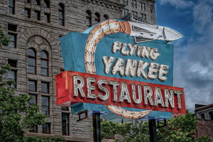
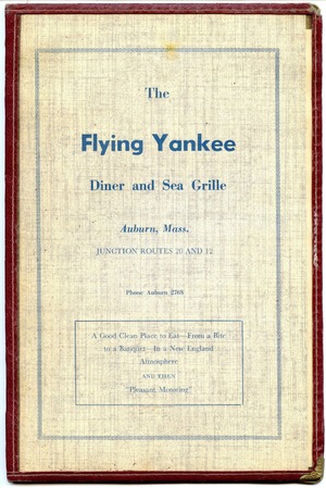
Flying Yankee Restaurant
Route 20 and Route 12 in Auburn, MA, c. 1953
In the 1950s and 60s, as national chains began to fill the landscape, there was an emerging sense that large commercial signs were contributing to a growing graphic conformity along the American roadside. Corporate logos for gas stations, restaurants and motels varied little from place to place. Distinctive signs like Tony Hmura’s colorful neon marquis for the Flying Yankee diner in Auburn countered blandness, catering to individual business owner’s tastes and forging connection to local history.
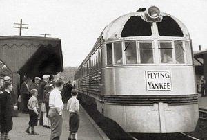
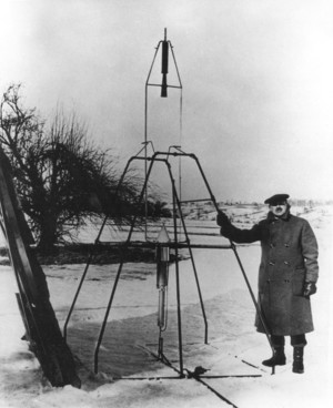
While the name of the diner evoked a connection with a much-loved New England streamliner train, the rocket logo, with its distinctive flashing tail, celebrated the accomplishment of local aerospace inventor Dr. Robert H. Goddard. Goddard made history when he launched the world’s first liquid-fueled rocket in Auburn in 1926. The site of Goddard’s rocket launch, which took place on the Ward Farm (now Pakachoag Golf Course) was commemorated with a plain granite obelisk. The Flying Yankee’s sign added visual excitement to the location of the diner while celebrating local history and the beginning of the space age.
Sign-makers were required to sign their work by affixing tags of nameplates called “snipes”, making attribution easy. Sign Layout Artists learned their trade at specialty schools or in some cases, were self-taught through inexpensive sign-maker’s manuals, gaining technical expertise by experiment. Tony Hmura, the creator of the Flying Yankee’s eclectic sign was an exception. As the founder of Leader Signs, Hmura grew a successful sign business after returning from military service in WWII. Hmura’s design skills, as well as his ongoing community involvement as an active leader of various civic groups means that his works are easy to identify, even without a snipe. Leader Sign designed and fabricated dozens of distinctive signs around Springfield. The Flying Yankee’s sign is unique in its fusion of automobile-friendly scale, railroad nostalgia and celebratory rocketry: three forms of transportation technology neatly encapsulated in one neon sign.

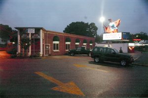
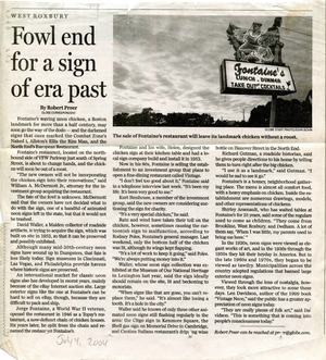
Fontaine's Restaurant
VFW Parkway, West Roxbury MA, 1952
Topsy the neon chicken was a source of enormous pride for George Fontaine, who sketched the bird’s design at his kitchen table in 1952. Fontaine wanted to celebrate his purchase of the restaurant which he had been managing for a local chain since returning from military service in World War II. (Fontaine, who served under his given name of George Fotonakes, was held as a prisoner of war after being shot down in France). When the Winthrop-born serviceman finally purchased the restaurant on the West Roxbury-Dedham line, it was the fulfillment of his long-held dream of owning his own restaurant. Together, George and his wife Helen Fontaine expanded to 160 seats, serving fried chicken, prime rib and pot pie to hundreds of locals each day.
As a veteran, Fontaine would have been eligible for start-up money through the business assistance program of the 1944 Servicemen’s Readjustment Act (better-known as the GI Bill). Whether or not the Fontaines took advantage of GI Bill funding to start their restaurant, there is no question that the success of their joint venture rested on a different provision of the same legislation: both West Roxbury and Dedham swelled with baby-boom families in the 1950s. Many of these families took advantage of the GI Bill’s mortgage guarantee program to finance the purchase of their houses. Suburban prosperity, and the disposable income which came to the new middle class, was a key part of George and Helen Fontaine’s success. Built in the right place at the right time, their restaurant would serve as a neighborhood hub for nearly sixty years.
Mounted on an angular pylon designed to resemble a streetlight, the double-sided Fontaine’s sign became a distinctive landmark in the suburban landscape. The restaurant’s sign incorporated three different types of light in its signage – as well as the same number of typefaces in its lettering – but only Topsy the chicken was illuminated in neon. (The streetlight initially used incandescent light; the horizontal panel which bore the Fontaine’s name was backlit fluorescent). The sign was especially eye-catching at night, when the chicken’s animated flapping-wing effect came fully to life, beckoning customers inside. George and Helen Fontaine both took pride in the individuality of their restaurant, advertising Fontaine’s as an alternative to “corporate cookie-cutter” competitors. Like many postwar entrepreneurs, George and Helen Fontaine infused their familiar recipes with just enough novelty to create a successful business enterprise; the recipe for Fontaine’s fried chicken was much sought-after but never duplicated.
When Fontaine’s closed in 2004, it marked the end of an era in more than one way. George and Helen had successfully catered to the baby boom generation’s culinary tastes and needs. Topsy the chicken, who was still in operation when the restaurant closed, was one of the last animated neon signs in greater Boston. Today, Kenmore Square’s CITGO sign, the North End’s La Cantina and the Theater District’s Paramount are some remaining examples of this once-popular form of signage.


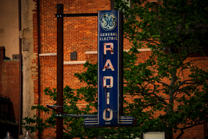
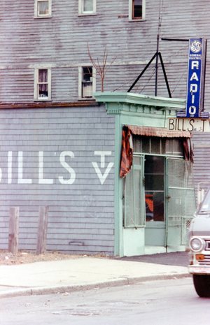
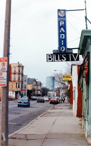
General Electric Radio
240 Blue Hill Avenue, Roxbury MA, c. 1925
The oldest sign on display in this exhibition, this GE Radio sign dates from the mid-1920s, when Claude Federal dominated the production of neon signs in the United States. Georges Claude, the French inventor who first mastered the production of commercially-viable neon tubing in Paris, began selling neon signs in the US in 1923. Claude pursued partnerships with large companies like General Electric, which had a vested interest in the success of his technology. Small merchants like Bill’s Radio and TV in Roxbury embraced ready-made signs like this one as an easy, affordable way to add glamour to their storefronts.
When Bill Weiner opened his store in 1925, he would have primarily sold radios, as regular television broadcasting did not begin in the United States until 1948. This neon sign, with its up-to-date vertical lettering and Art Deco styling, advertised both a new communication technology and a local destination where consumers could find the necessary products for enjoying the new technologies.
Although signs like this one are now rare, General Electric has a long history in Massachusetts. The company was founded by a merger of Lynn’s Thomson Houston Electric Company and the Edison Electric Company of New Jersey in 1892. Plans for the new GE Headquarters in Fort Point depict a large illuminated logo on top of the building, forging a glowing sense of visual continuity with old signs.
Small, single-story storefronts like Bill’s were once typical along Blue Hill Avenue and other significant transit routes in Roxbury. Commuters, enticed by affordable horse car fares, had begun moving out of central Boston as early as the 1850s. By the 1920s, Blue Hill Avenue and the streets around it contained a bustling mix of small-scale retail and residential triple-decker buildings. Projecting from the front of Bill’s shop, the GE Radio sign fit well in its environment: simple capital letters of the word “radio” were large enough to be seen easily from a passing street car. Yet like the European Restaurant sign also on display in this exhibition, the GE Radio sign was small enough to fit within the pedestrian scale of the buildings around it.
Bill’s store quickly became a neighborhood institution; it is possible that many of the working- and middle-class residents saw their first televisions in his window. Bill’s name became a constant in the changing worlds of both communication technology and Boston neighborhoods. When A.A. Viale bought the store in 1967, he found it easier to allow customers to call him by the previous proprietor’s name than to assert the change of ownership on the front of the store.
Photos of the store from the late 1980s record the passage of time in Roxbury, as well as the manner in which many early neon signs were modified by individual store owners to personalize their storefronts. The use of neon signs like Bill’s GE Radio sign declined after 1932, when Georges Claude’s American patent expired. Although some store owners would continue to reach for ready-made signs through the Great Depression as a means of inexpensively updating their storefronts, the stage had been set for neon’s next phase. After WWII, a new generation of entrepreneurs reached for neon’s greatest potential in the American marketplace. Neon’s low production cost in the postwar period, along with its fall from grace among corporate clients, led thousands of owners of family-run diners, hotels, factories and repair shops to commission their own signs. These postwar signs, often larger than their prewar predecessors, were as distinctive, ambitious and creative as the small businesses which flourished from the 1950s to 1970s.

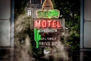
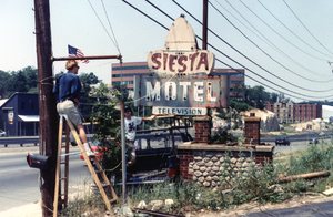
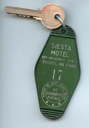
Siesta Motel
Rt. 1 N, Saugus MA, c. 1950
Fantasy was a recurrent theme of roadside neon signs. In the dark, some drivers could easily imagine themselves to be somewhere other than New England highway, and roadside architecture like the Siesta Motel sign catered to America’s fascination with the old West. The pairing of an oversize sombrero and neon cactus might now seem out of place along a Saugus roadside, but when the owners of the Siesta Motel opened their new venture on the northbound side of Route 1, the eye-catching sign was just the right image to set their business apart from the competition.
The motel, visible in the images, was a plain single-story structure, much like thousands of other simple buildings which sprouted across the United States and the national highway system expanded. The motel’s forecourt offered easy parking, and the Siesta’s simple offer of a place to sleep with a television to watch in the evening kept the destination accessible to middle-class motorists. Bold neon signs, like the double-sided Siesta sign, were an effective way for individual motel owners to compete with the corporate chains which began to dominate the accommodation industry by the postwar period.
Construction along the edges of Route 1 boomed after the former Newburyport Turnpike was widened into a highway in the 1930s. Commercial activity and creative designs continued through the postwar years. The relatively small scale of the New Deal-funded highway, with its frequent turn offs, made it an attractive site for developers – as did the relative lack of zoning on the commercial plots along the side of the road. Some of the brightest, boldest, and most eccentric roadside architecture in New England blossomed along the Saugus strip and adjoining sections of Route 1.
Many of the Route 1 signs, including the Siesta’s, as well as the Leaning Tower of Pizza, were designed and fabricated by the The Salem Sign Company. The small local company, which was run by a Danvers-raised immigrant named Joseph Finocchio, prospered on the patronage of the North Shore entrepreneurs. Never quite as famous as the lights of Las Vegas, the Saugus strip nonetheless featured such marvels as a gigantic orange dinosaur looming over a mini- golf course; the enormous neon cactus and fiberglass cows of the Hilltop Stop Steak House, the unforgettable Chinese gate and the Polynesian interior at Kowloon. The Siesta’s sign, with its simple two-part sombrero and cactus motif and functional “Vacancy” lettering was quite plain in comparison with these later projects.
The eccentric splendor of postwar commercialism along the highway induced motorists to pull over and part with their savings; it also inspired writers and architects to reconsider their definition of beauty. While some people saw signs like the Siesta’s as roadside clutter or visual pollution, others appreciated the cheerful commercial honesty of its aesthetic. In 1972, Robert Venturi, Denise Scott Brown and Steven Izenour published Learning from Las Vegas: The Forgotten Symbolism of Architectural Form. Inspired by landscapes like Route 1, the three architects argued for a new appreciation of vernacular architecture and commercial signage. Their short, powerful tract changed the course of professional architecture in America. Meanwhile, many Americans grew to love the strange, unlikely neon beacons of home along their local strip, no matter how out of place the cultural or horticultural references.

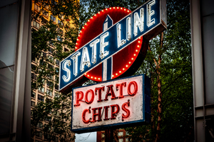
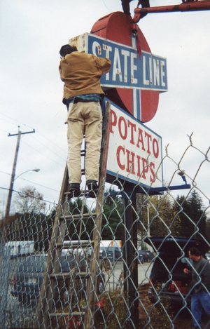
State Line Potato Chips
Route 20, Wilbraham, MA, c. 1950s
The only factory sign in this exhibition, the State Line sign clearly articulates the name of a locally-produced snack food against a red circle ringed with small incandescent white bulbs. The name of the Wilbraham-based company refers to the company’s origins in nearby Enfield, Connecticut. According to company lore, the first State Line chips were fried up in a family-run kitchen on a property which straddled the Massachusetts-Connecticut state line. Production of the popular treat was scaled up when Abraham Katz opened the factory in Wilbraham in 1927, and the factory became a reliable source of employment in the growing agricultural and industrial town. (Friendly’s Ice Cream was another major Wilbraham employer, moving there after State Line had already opened its factory). State Line’s bright neon sign, which was fabricated by Howard Scheckterly of Ace Signs in Springfield, popularized the brand and tempted drivers along Wilbraham’s section of the old Boston Post Road to stop for a snack. Schoolchildren growing up in the area enjoyed fresh, hot chips as a special treat, and the factory was often open for tours.
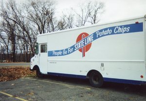
State Line’s striking logo depicts one of the stone obelisks which mark state boundaries throughout the region, making the finished logo an unusual and amusing sign-within-a-sign. As many as 40 delivery trucks emblazoned with the same logo brought fresh potato chips to retailers throughout New England during the peak years of production. Although potato chips are usually thought of a processed food, rather than farm-fresh product, they are not easily transported or stored without significant chemical intervention and complex packaging. “Delivered fresh, the morning after they’re made,” was the slogan printed on many bags of State Line’s potato chips, cheese twists and corn chips. State Line took advantage of local agricultural production and a growing interstate highway system to quickly produce and deliver a tasty and salty snack to New Englanders in the postwar years.